Portfolio · Engineering & telecoms · Rebrand

momentum,with precision.

Exctel Engineering designs, builds and integrates telecoms, safety, security and automation systems for oil and gas, energy, transport and defence. The company had outgrown the identity it started with. We rebuilt it around the two qualities its clients rely on.

The new Exctel wordmark in white on black

where it started

The old identity was a blue, italic, all-caps wordmark with a swoosh through the X, used with stock photos of power stations. It served the business in its early years, but the company had grown from a team of two in 2017 to people working across 25 countries, and its identity had not kept pace.

The brief was an identity that reflected the company Exctel had become: established, international and precise, and distinct in a sector where most brands use blue and green.

BeforeExctel's previous visual: a stock photo of a power station with the old blue EXCTEL wordmark
AfterThe new Exctel wordmark: lowercase exctel with an orange x and a full stop

the idea: >.

Exctel works in places where failure isn’t an option: offshore platforms, refineries, control rooms. Its value comes down to two things: moving the project forward, and getting it exactly right.

The symbol expresses exactly that: A chevron for momentum and a full stop for precision. The same idea runs through the wordmark: lowercase so it feels approachable, the x shaped like the chevron, and a full stop at the end.


The Exctel symbol: an orange chevron followed by a black dot
> momentum
The Exctel wordmark reversed out in white on black
. precision

a distinct colour system.

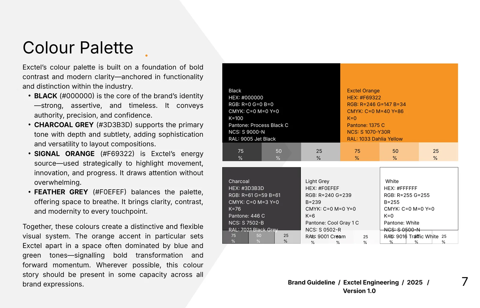
Black for authority, with a single orange accent that sets Exctel apart from the blue and green common across the sector. The orange is used sparingly so that it carries emphasis.

  • Black#000000Authority. The core of the wordmark.
  • Exctel Orange#F69322Energy and forward motion. Used with intent.
  • Charcoal#3D3B3DDepth for type and layouts.
  • Feather Grey#F0EFEFRoom to breathe.
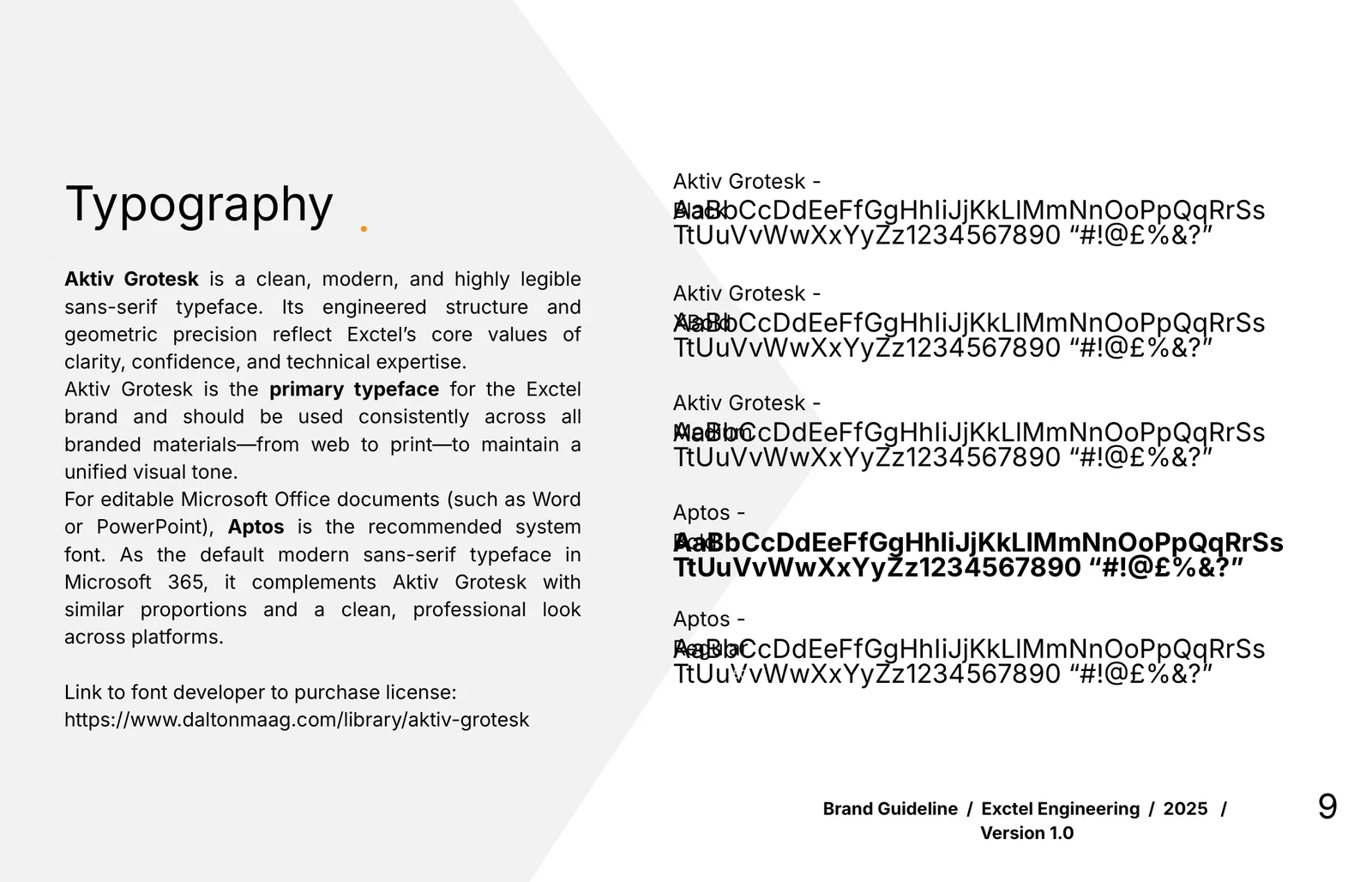
Aktiv Grotesk

Clean and technical, easy to read on site drawings and screens. Aptos is the stand-in for Word and PowerPoint, so files the team edits themselves still look on-brand.
built to be used.

With teams in Singapore, India, Nigeria and the UAE, the identity needed to be applied consistently everywhere. So it was delivered as a complete system: brand guidelines, colour and type standards, and stationery.

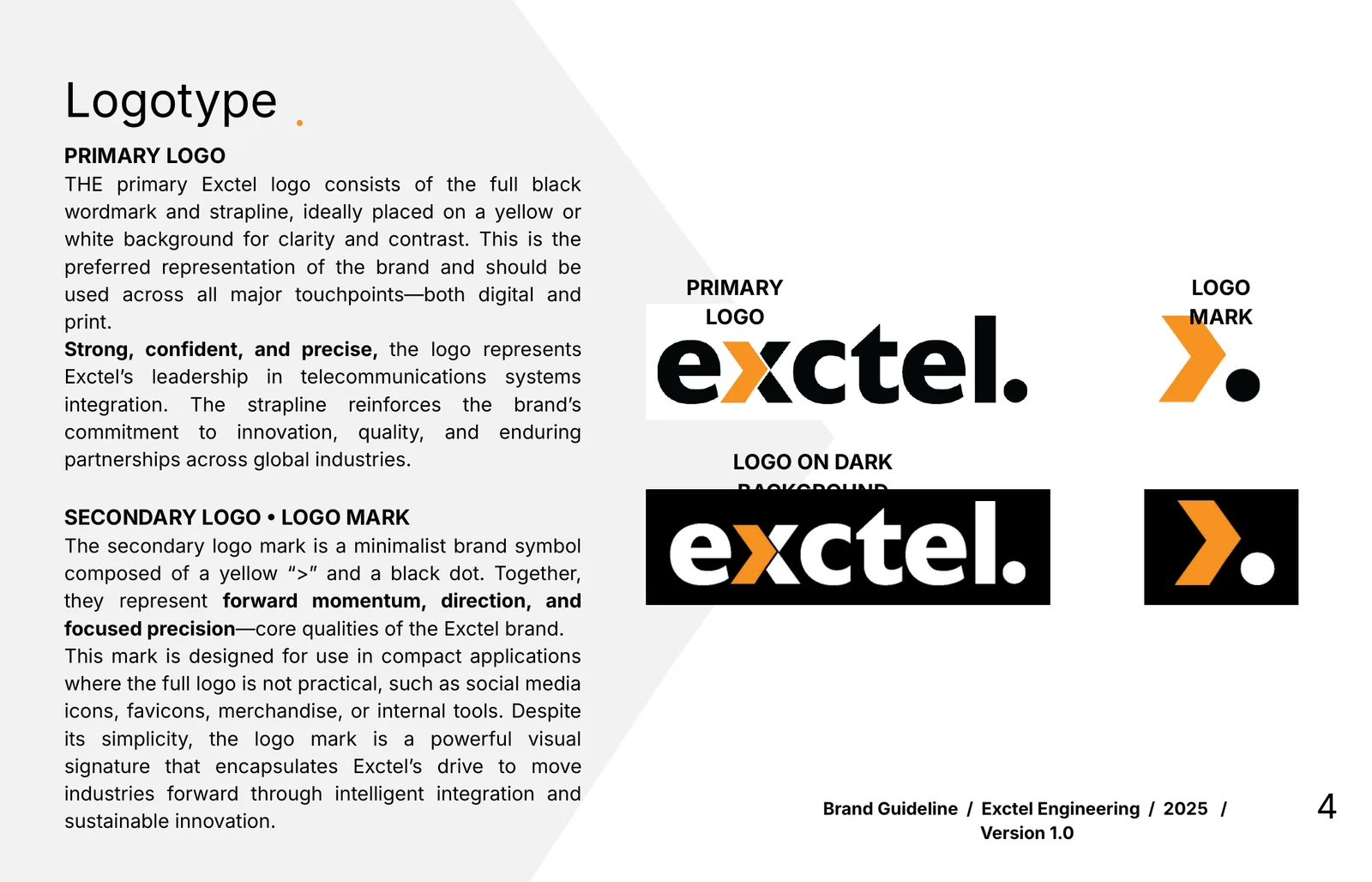
Exctel Brand guidelines — logotype
01Brand guidelines — logotypePrimary logo, logo mark and how each one is used.
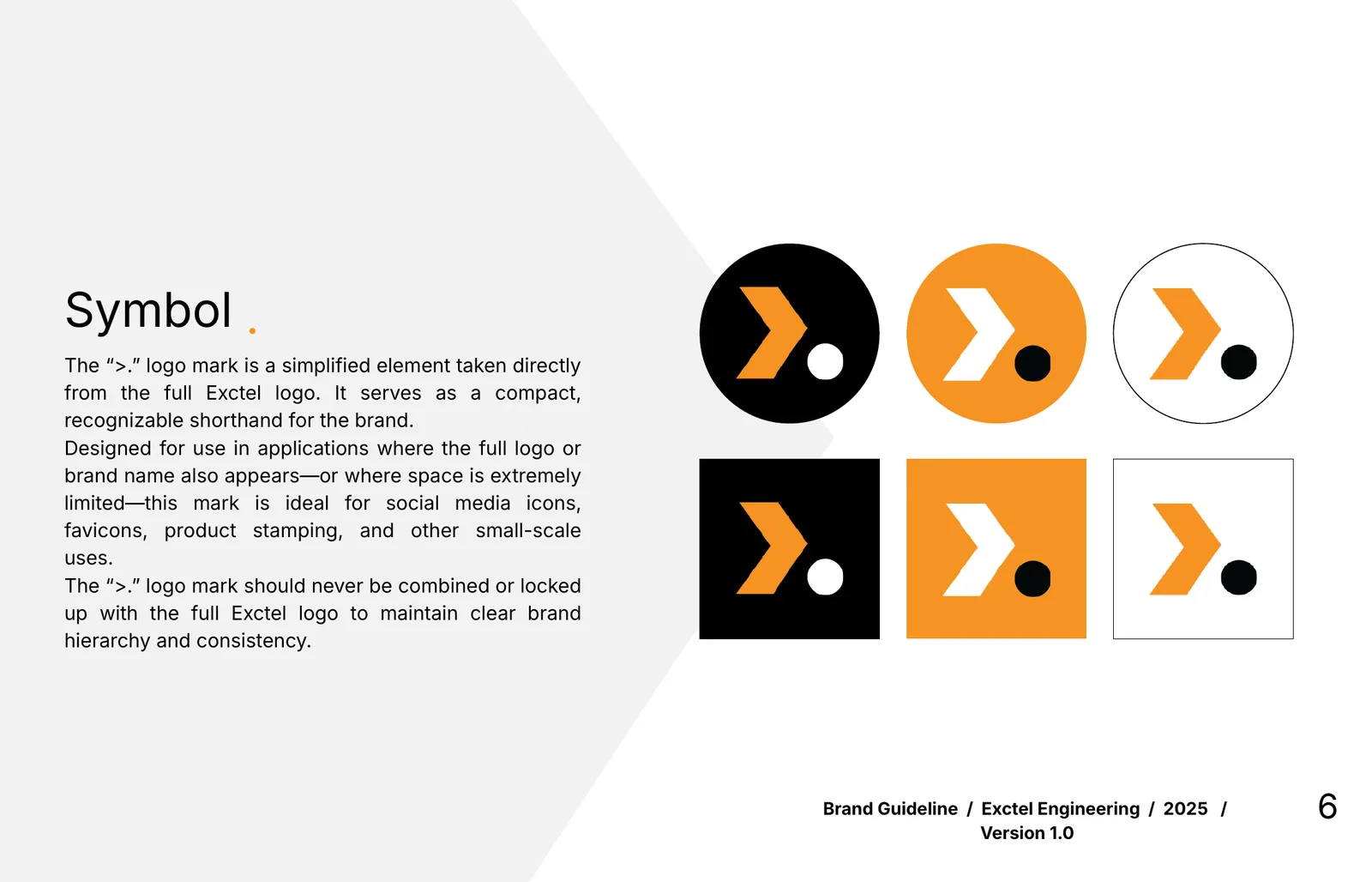
Exctel Brand guidelines — symbol
02Brand guidelines — symbolThe “>.” mark for icons, favicons and small spaces.
Exctel Brand guidelines — colour
03Brand guidelines — colourPrint, screen and paint references for every colour.
Exctel Brand guidelines — typography
04Brand guidelines — typographyAktiv Grotesk for the brand, Aptos for editable Office files.
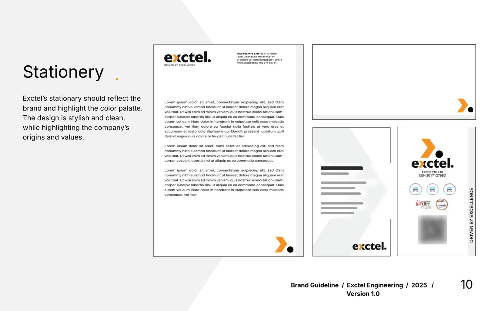
Exctel Stationery
05StationeryLetterhead, envelope and business cards.
Exctel Website
06Websiteexctel.com, carrying the same black, orange and full-stop signature.